Designing the infrastructure for cross-border money movement — balancing speed, trust, and compliance at scale.
-
SoFi had built a strong domestic money movement experience, but had no cross-border capability — leaving members without a way to send or receive money internationally. As global payments became a strategic priority, I led a ground-up effort to design SoFi's first cross-border payments platform for existing SoFi members. The challenge wasn't just building something new — it was doing it fast, within a complex regulatory and multi-market landscape, while holding a longer-term vision for standalone users and staying coherent with SoFi's broader money movement strategy.
-
Led design from the ground up as the principal designer on a small, fast-moving tiger team, working directly with the CEO, CTO, and VP of Product to shape both product vision and execution. Navigated the complexity of money movement across SoFi's broader ecosystem, making deliberate trade-offs to get to market quickly without losing sight of the evolving platform vision. Operated as the sole design voice across the full initiative, balancing speed with strategic alignment across teams.
-
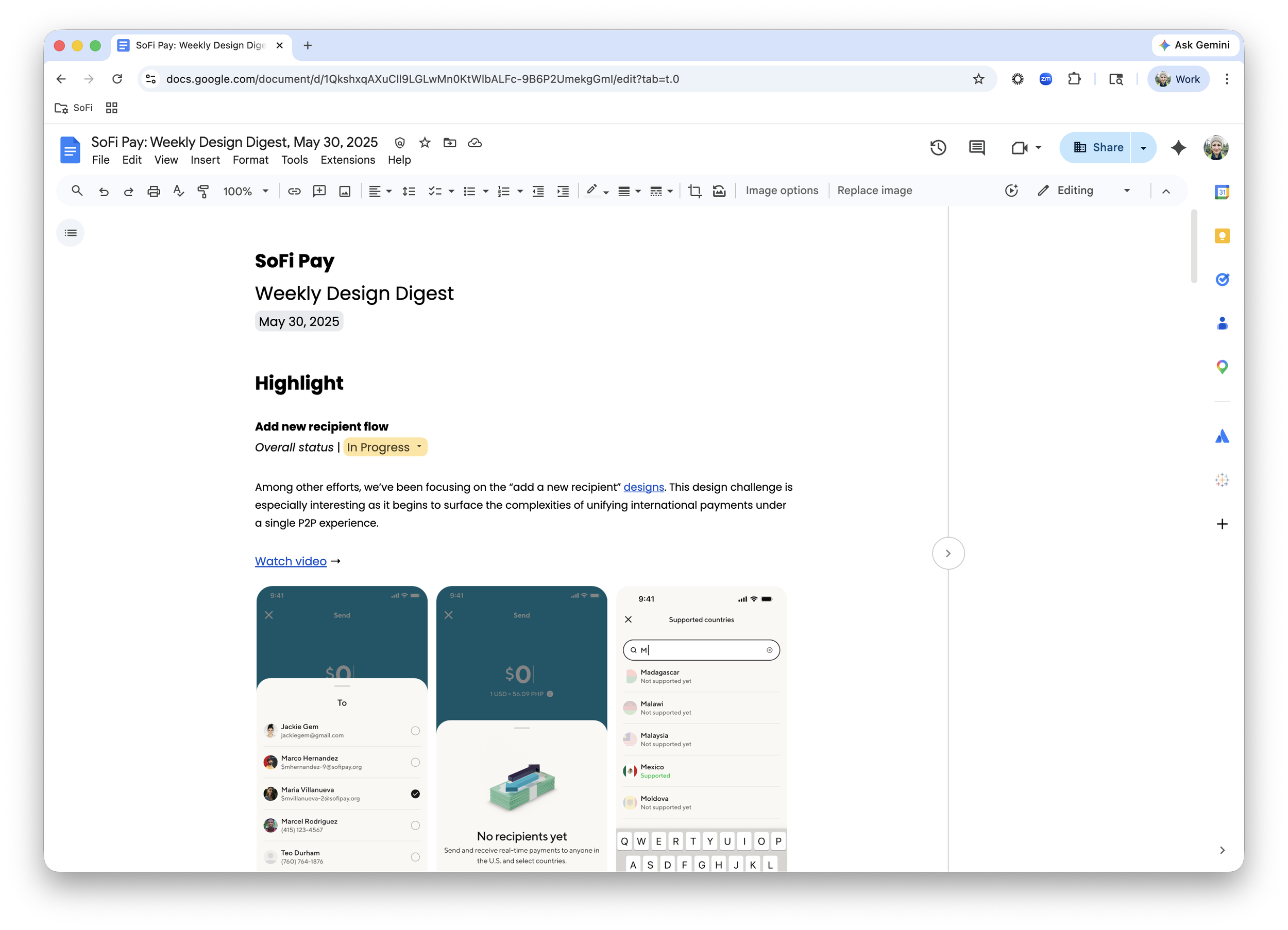
My first move wasn't to open Figma — it was to build the conditions for speed and alignment. I came in asking sharp questions to challenge early assumptions, drafted a design schedule, and immediately set up a Figma workspace, a Design Decision Log, and a weekly design digest to keep the team transparent and moving. I also rallied designers and researchers across SoFi's money movement projects to surface past research and work already in flight, ensuring nothing was built in a vacuum.
From there, I balanced two parallel tracks. For the future vision, I conducted a focused interview with the VP of Product and quickly synthesized concepts into a deck that helped the team see where the platform could go. For MVP, I grounded decisions in existing domestic P2P research to address known friction points, prioritized the most complex and compliance-heavy flows first to protect the timeline, and organized a three-day workshop to pressure-test early ideas with key stakeholders. Throughout, the team validated direction with internal employees who regularly send money internationally — keeping user needs close without slowing down.
Creating a system for decision-making
A big part of my role wasn’t just designing the experience—it was helping the team make better decisions consistently across a very complex system. To do this I introduced a structured way to evaluate and align on decisions across the team. Each decision was framed consistently:
Clear description of the problem
What decision needed to be made
My recommendation
Supporting designs
Key factors to consider (user, business, technical, regulatory)
Final decision + owner
This helped us move quickly without losing alignment, especially as we navigated tradeoffs between simplicity, trust, and long-term scalability.
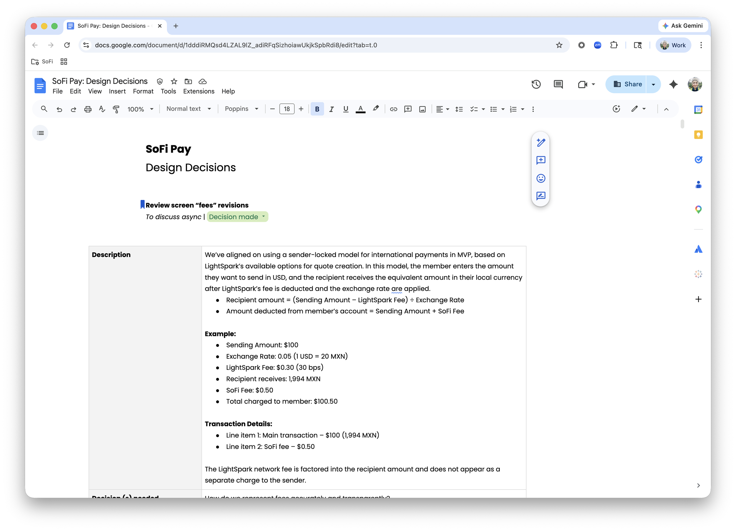
Fee Transparency
One example was how we handled fees. With cross-border payments, fees are distributed across multiple layers—exchange rates, network fees, and SoFi fees—and we had to decide how to represent that transparently without overwhelming users.
We made a deliberate decision to align certain fees with the recipient amount and introduce early education to reduce surprise and build trust.
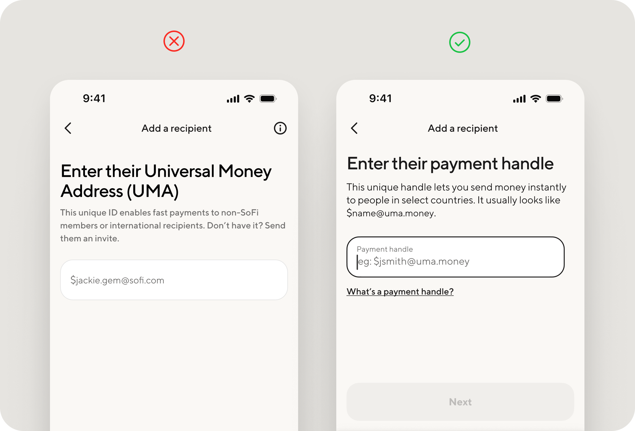
Language Abstraction
One of the core challenges was how partner systems and terminology showed up within SoFi’s ecosystem. We made deliberate decisions about what to expose and what to abstract—translating technical concepts like UMA into more intuitive language like “payment handle,” while maintaining transparency where it mattered.
The goal wasn’t to hide complexity, but to make it understandable and usable.
Making Complexity Legible
As the project grew in complexity and pace, I saw a need for a consistent way to keep cross-functional partners aligned on progress, decisions, and risks. I introduced a weekly design digest to make that visible. It included:
Progress across key workstreams
Key decisions and rationale
Risks, blockers, and dependencies
Cross-functional updates
This became a critical tool for maintaining alignment across design, product, engineering, and leadership—especially as requirements shifted and timelines compressed.
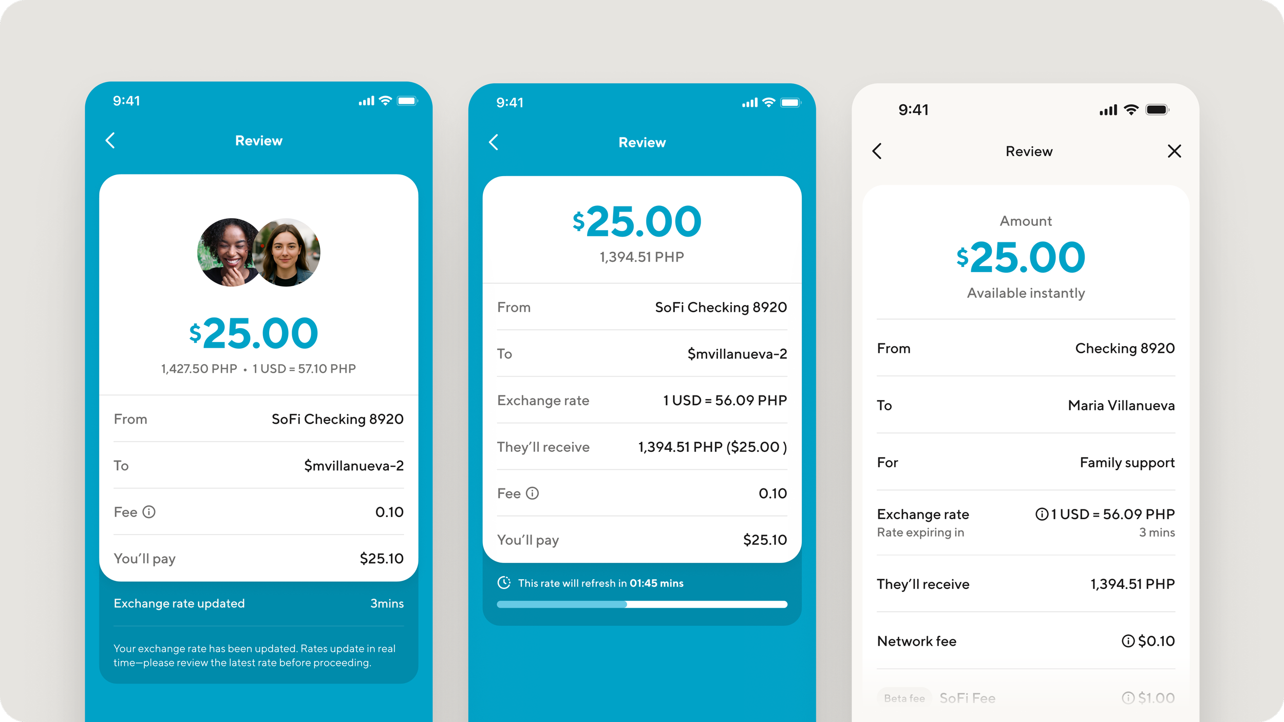
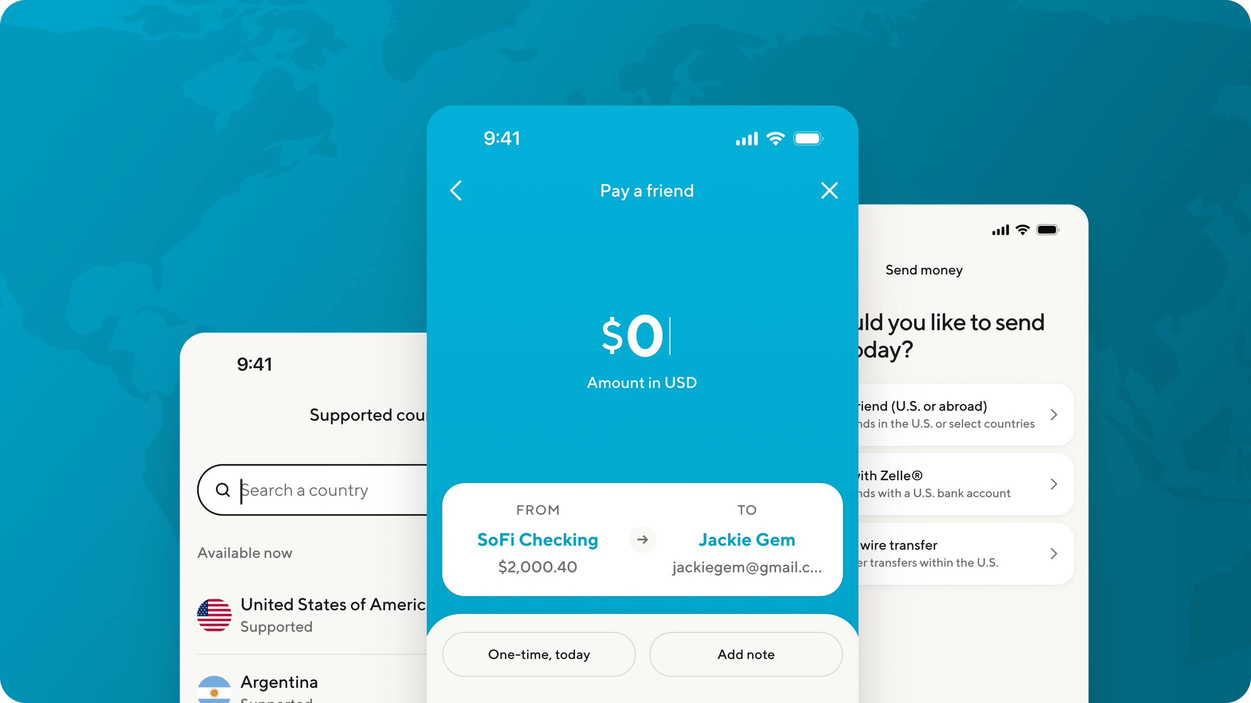
review screen evolution + real time state changes
The review screen wasn’t just a final checkpoint—it became a place where system behavior had to be clearly and honestly communicated.
With real-time exchange rates, the state of the experience was constantly shifting. That raised a core design question: how do you make something that’s changing feel stable and trustworthy?
Internally, I used a weekly design digest to keep teams aligned as decisions evolved—capturing what changed, why it changed, and what it meant across product, design, and engineering. Alignment had to be actively designed alongside the experience itself.
Externally, the challenge was transparency. We needed to communicate rate changes in a way that felt clear and fair without overwhelming the member. Done well, this builds trust. Done poorly, it breaks it.
partner integration, Edge Cases, Pivots & More
Title
Description
Looking Ahead
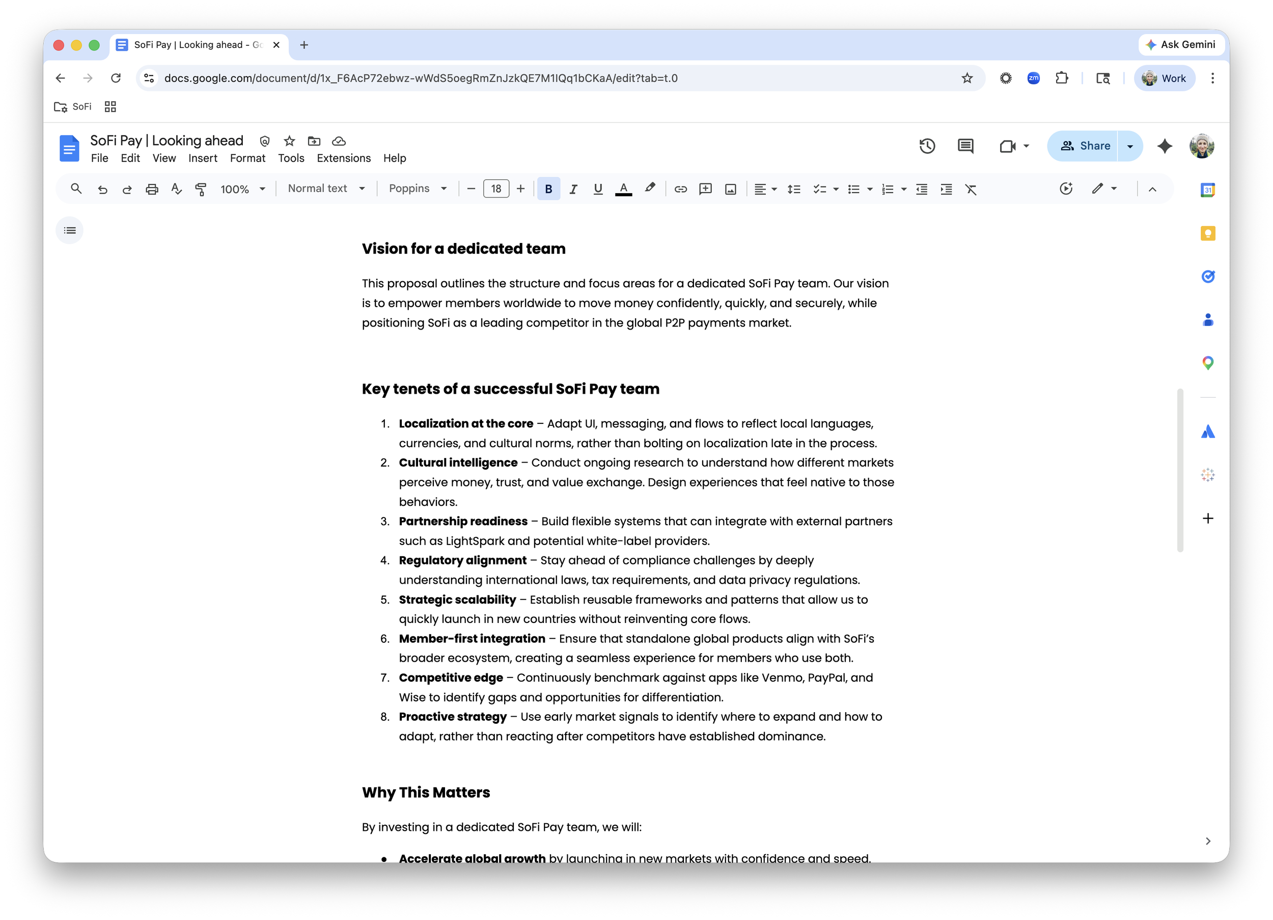
As we approached MVP, I began thinking beyond launch—focusing on how we could scale into a global money movement platform. We were already seeing early signals of risk — increasing regulatory complexity and a small team stretched across global initiatives. To address this, I developed a forward-looking proposal outlining how to scale globally—across product, design, and team structure with key focus areas including:
Localization as a core system (not a layer)
Cultural intelligence as input to design
Scalable patterns for multi-market expansion
Tight integration with partners + compliance
Looking Back
Title
Description
Title
Description
Title
Description
Title
Description